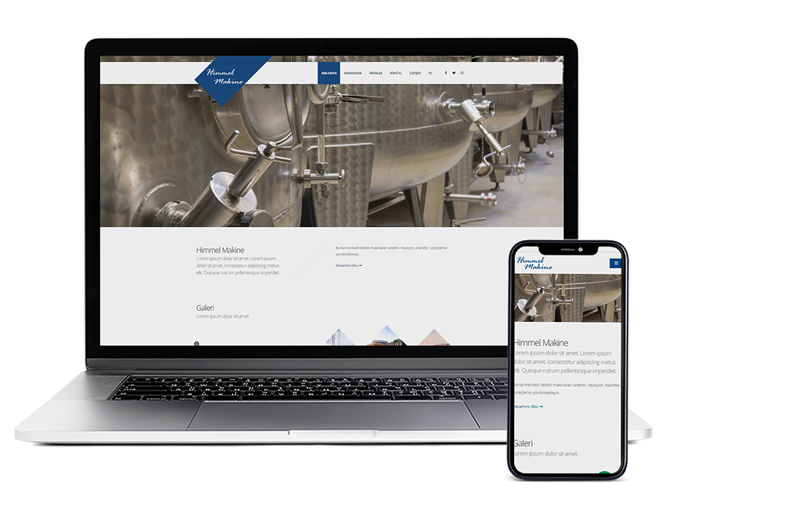
Himmel Machine


- Custom Design
- Responsive Design
- Multi-Language Support
- Special Management Panel
- On Page SEO

- #164a81
- #ffffff
-
#1
Open Sans
Himmel Machinery Corporate Web Site Design
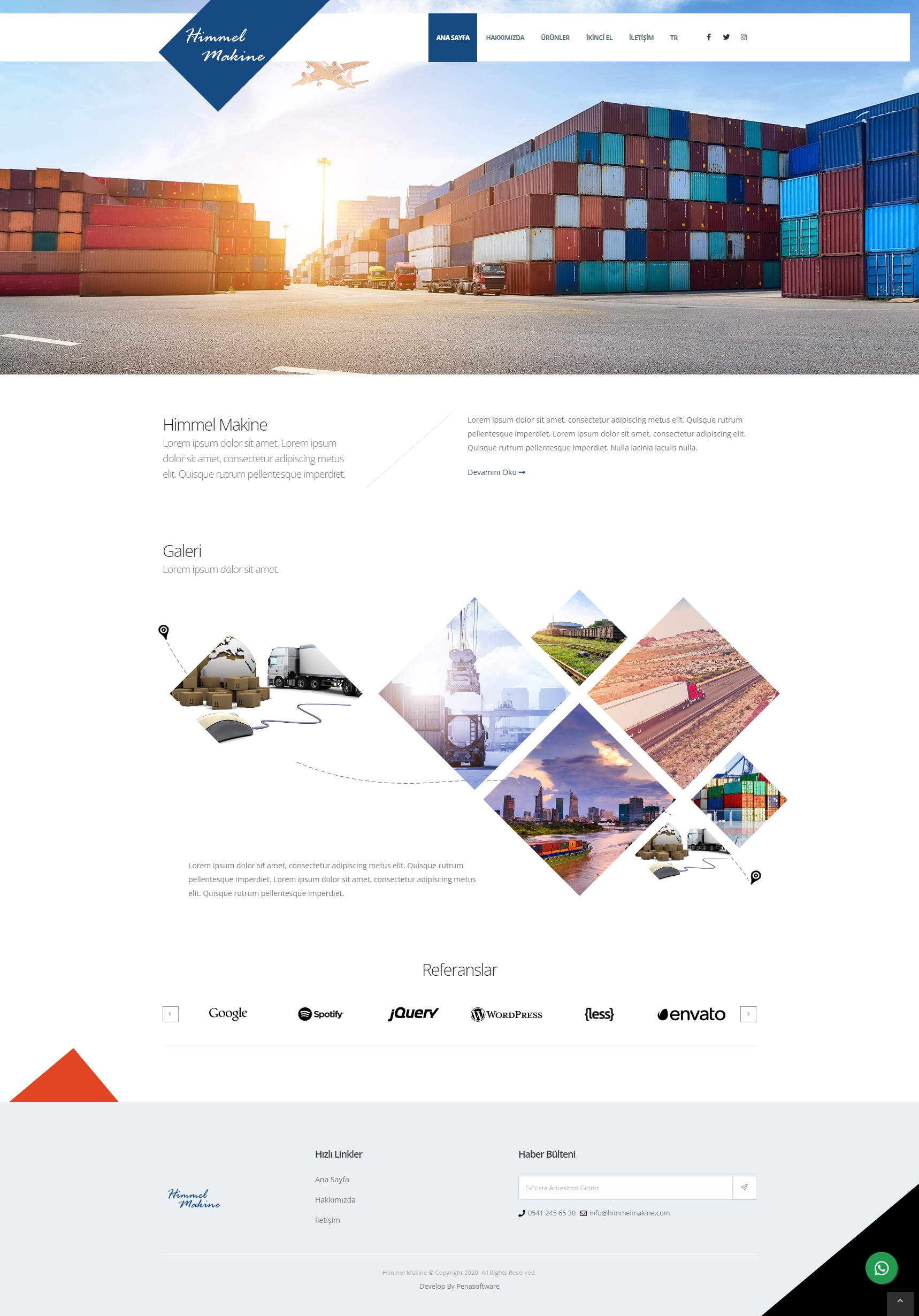
For the design of Himmel Makine corporate website, first of all, the contents were evaluated. Depending on the products offered by the company, a design that users can easily access has been created. We aimed for the website to be pleasant and user-friendly.
Product Oriented Design
The website design was designed to focus on the products Himmel Makine offers for sale. We have enabled users to quickly find the products they are looking for and access detailed information. We designed an interface that offers an easy-to-use and navigation experience.
Attractive Homepage Design
The home page of the website has been carefully designed to attract the attention of visitors and convey the important messages of the brand. We have provided a visually impressive design and an arrangement that directs users to the content. Thus, users were attracted to the website and they were able to learn more about the company by maintaining their interest.
Placement of Corporate Appearance and Content
With the placement of appropriate content and images on the website, Himmel Makine's We emphasized the corporate image. We created a sense of trust and professionalism by using content that reflects the mission, vision and quality understanding of the business. The website enables the brand to display a strong corporate identity.
Compliance with the Internationally Valid Criteria
We aimed that the Himmel Makine website comply with the internationally valid criteria. In this way, the website can effectively welcome visitors from different countries and help the brand create a strong presence in the international market. aims to establish. We have worked diligently to create a digital asset that accurately represents the brand's products and corporate identity.
